Biltmore winery & Amber Echo
A study in contrast.
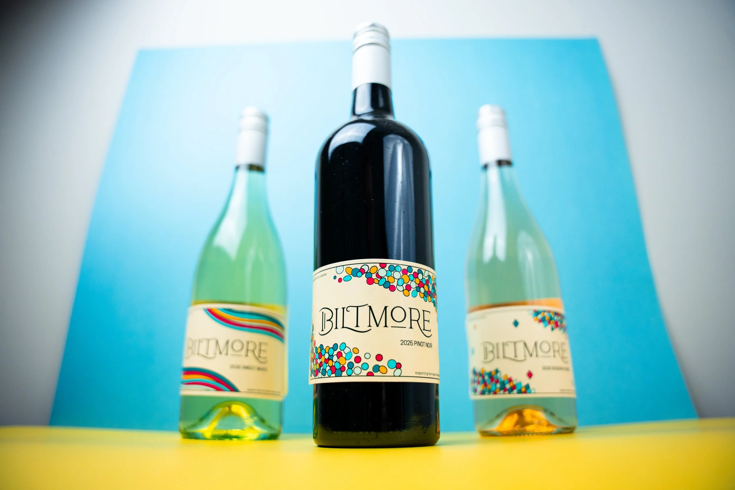
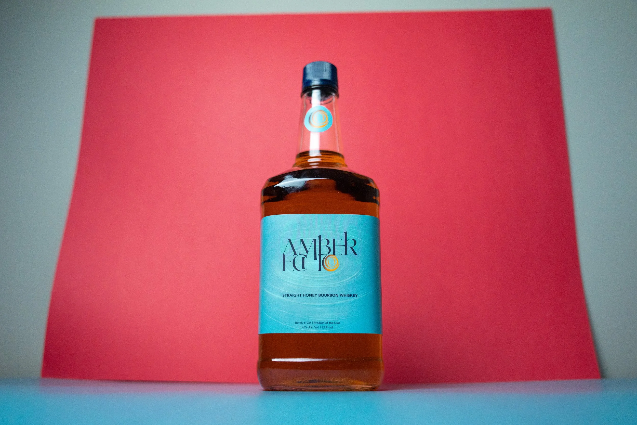
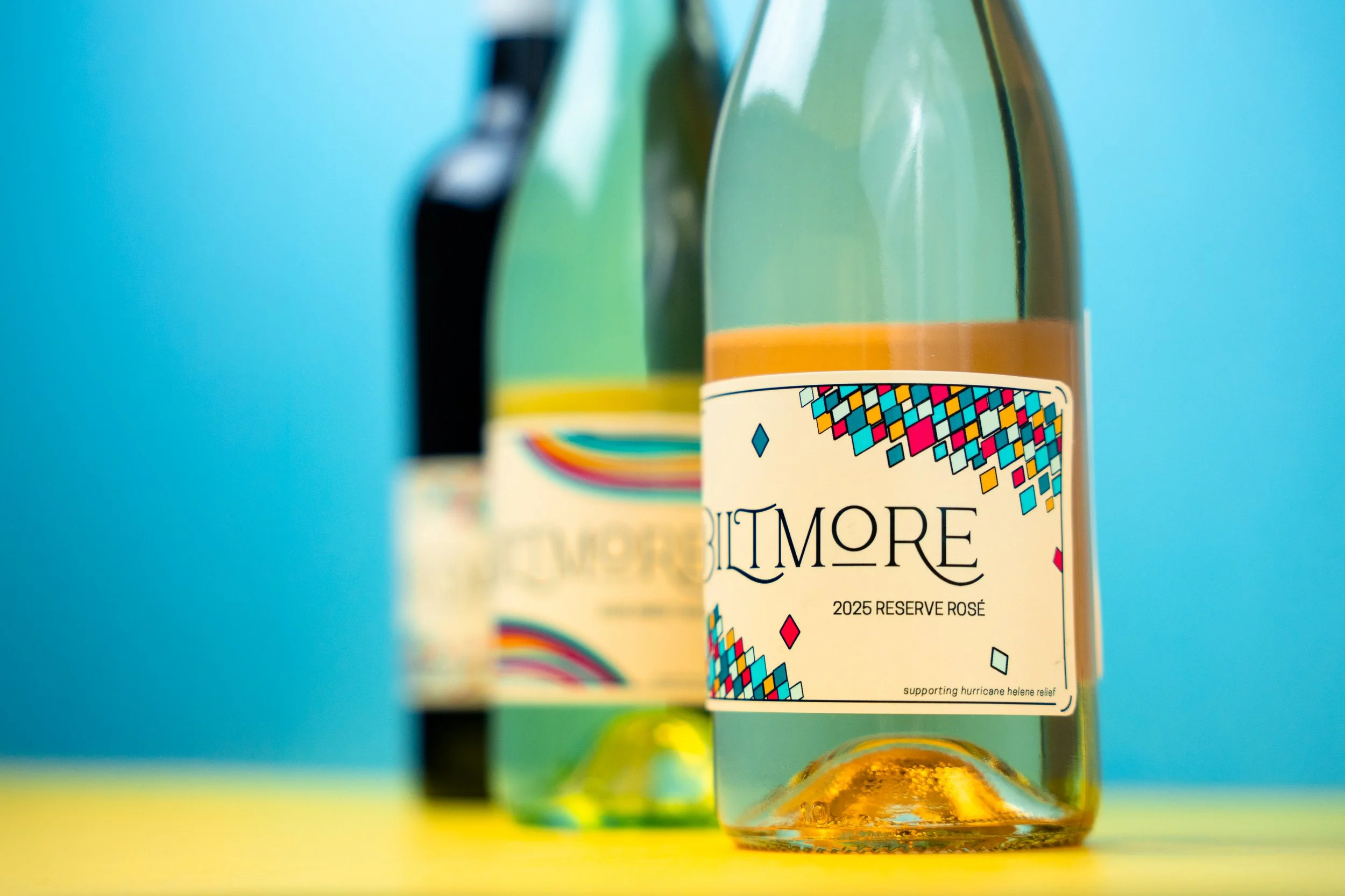
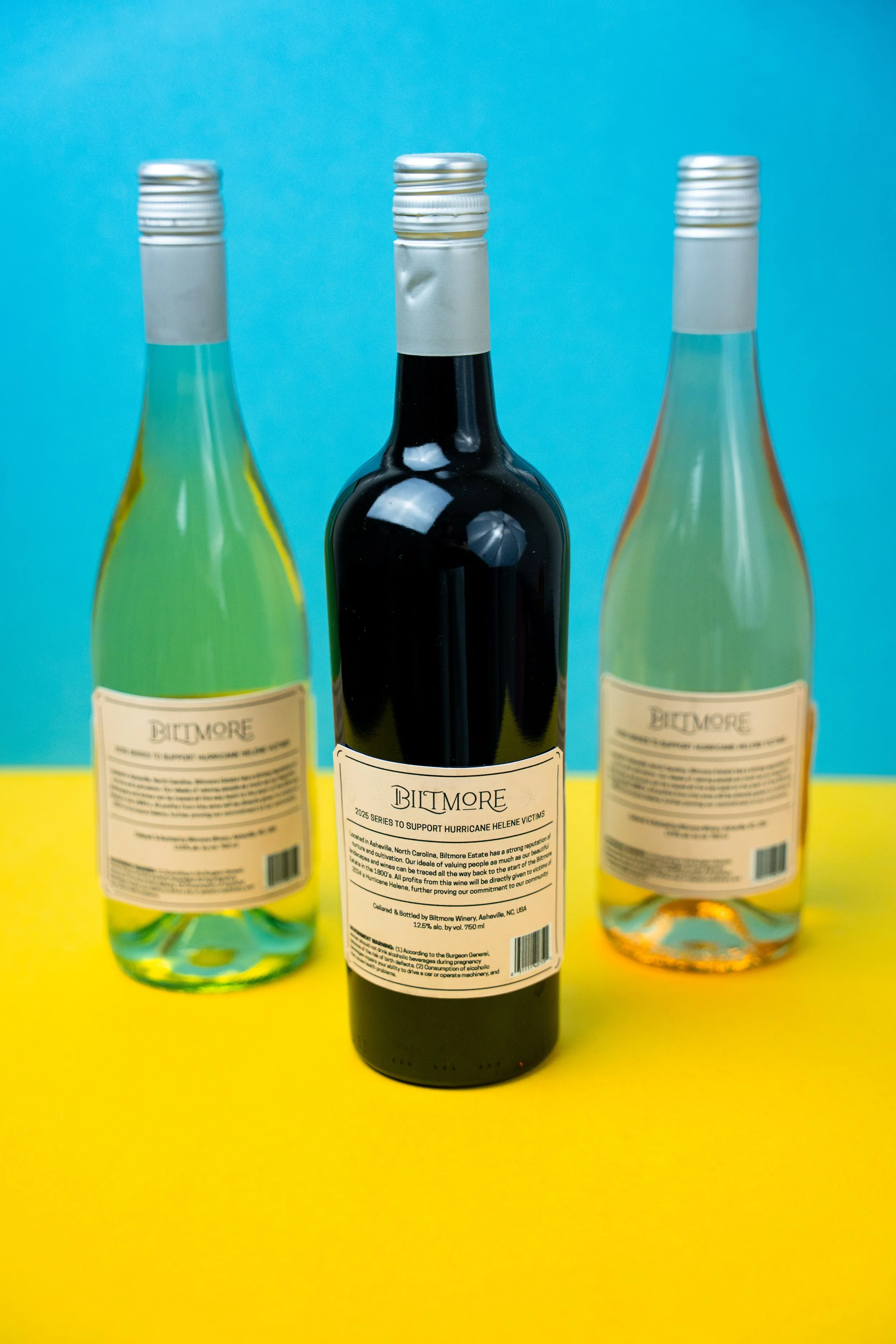
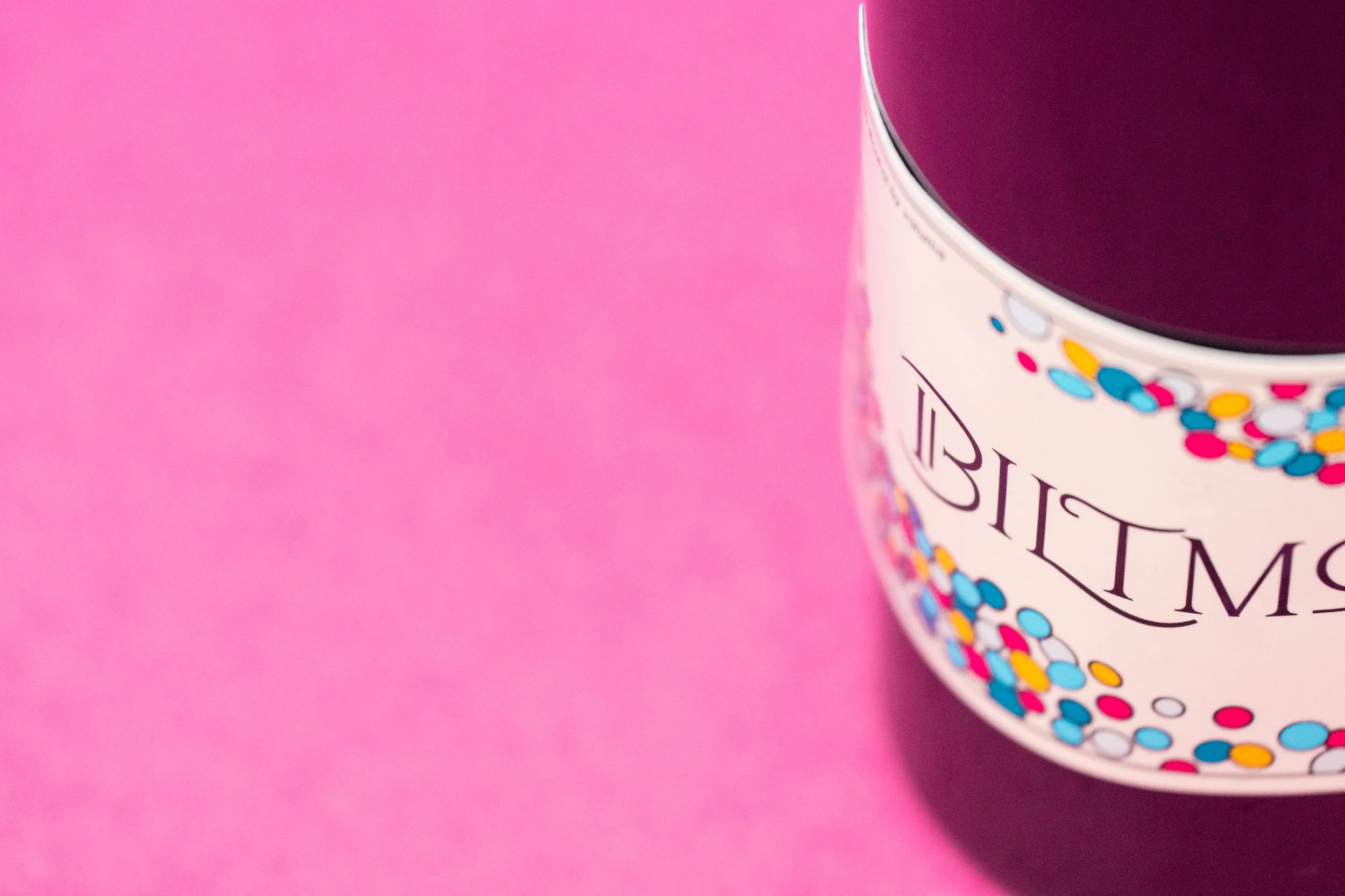
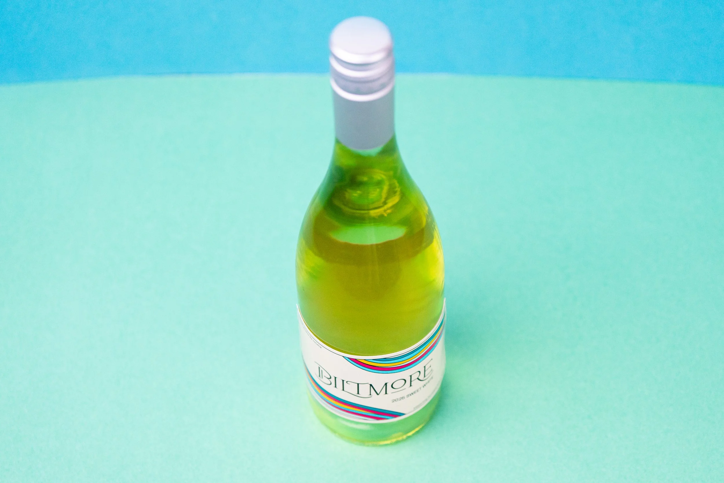
This page brings together two branding projects that explore opposite ends of the same spectrum. The Biltmore concept celebrates color, optimism, and community through a limited-edition wine series inspired by the estate's heritage. Amber Echo moves in the opposite direction, embracing warmth, nostalgia, and quiet reflection through a premium whiskey identity. Together, they demonstrate how visual language can shape entirely different emotional experiences.
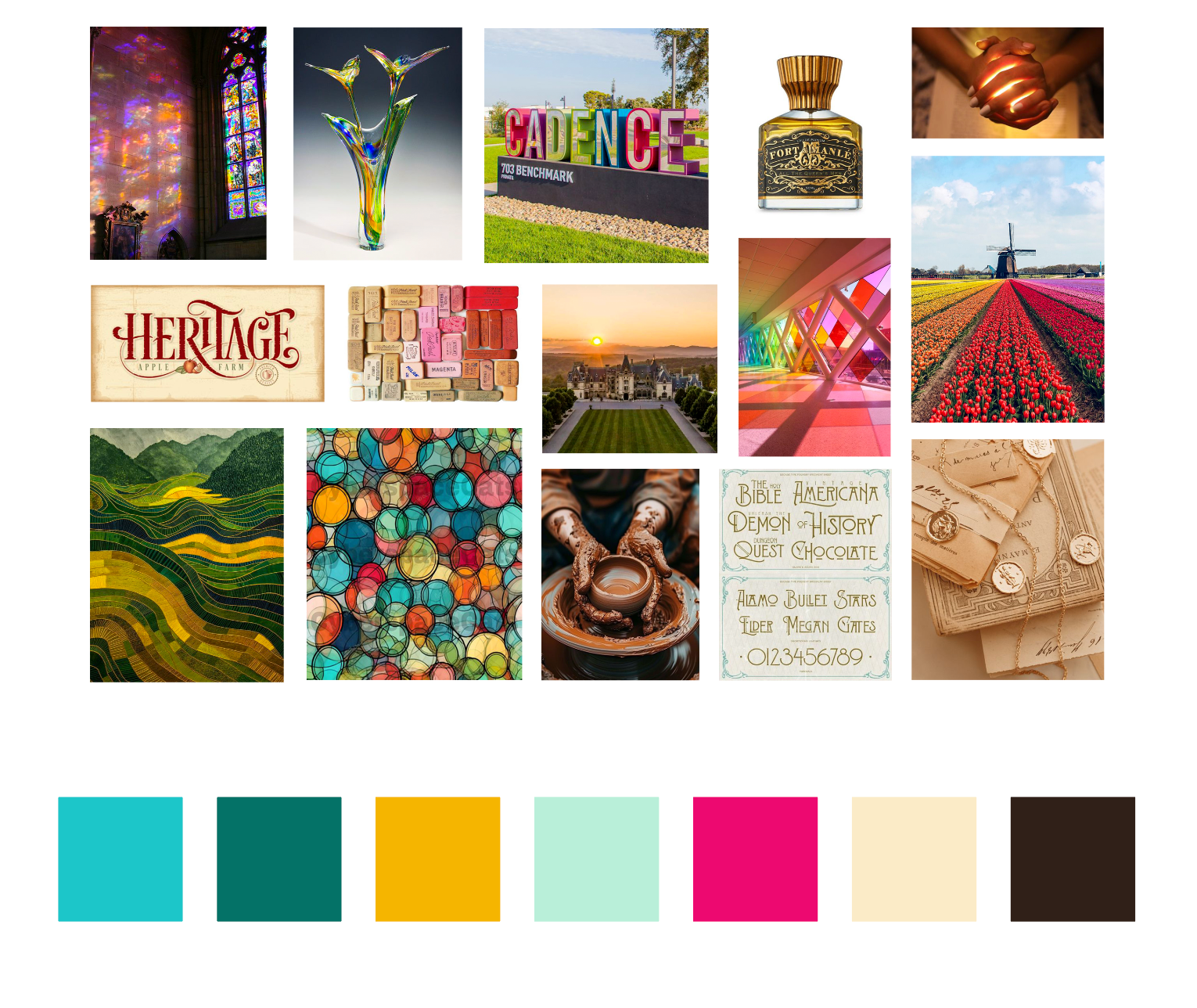
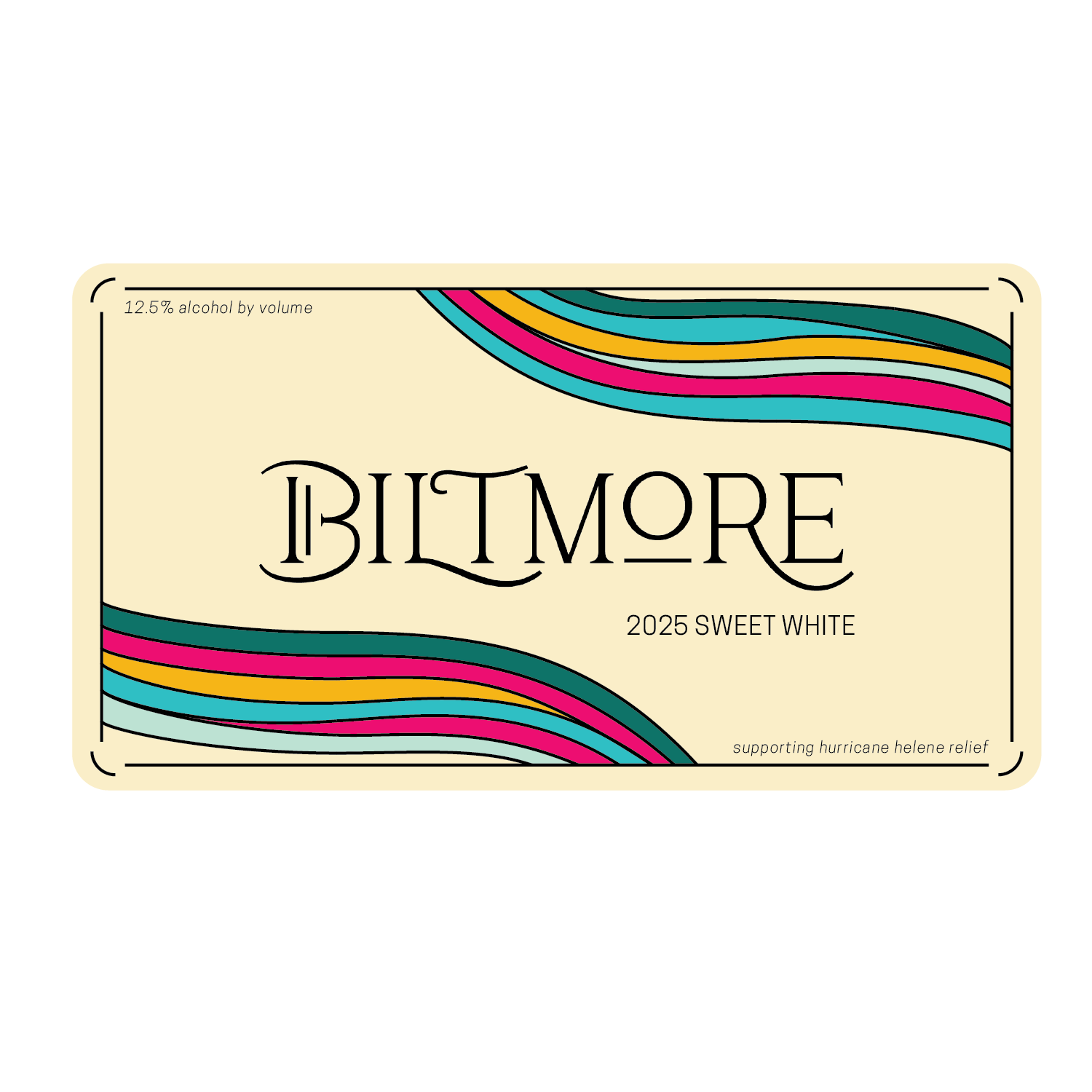
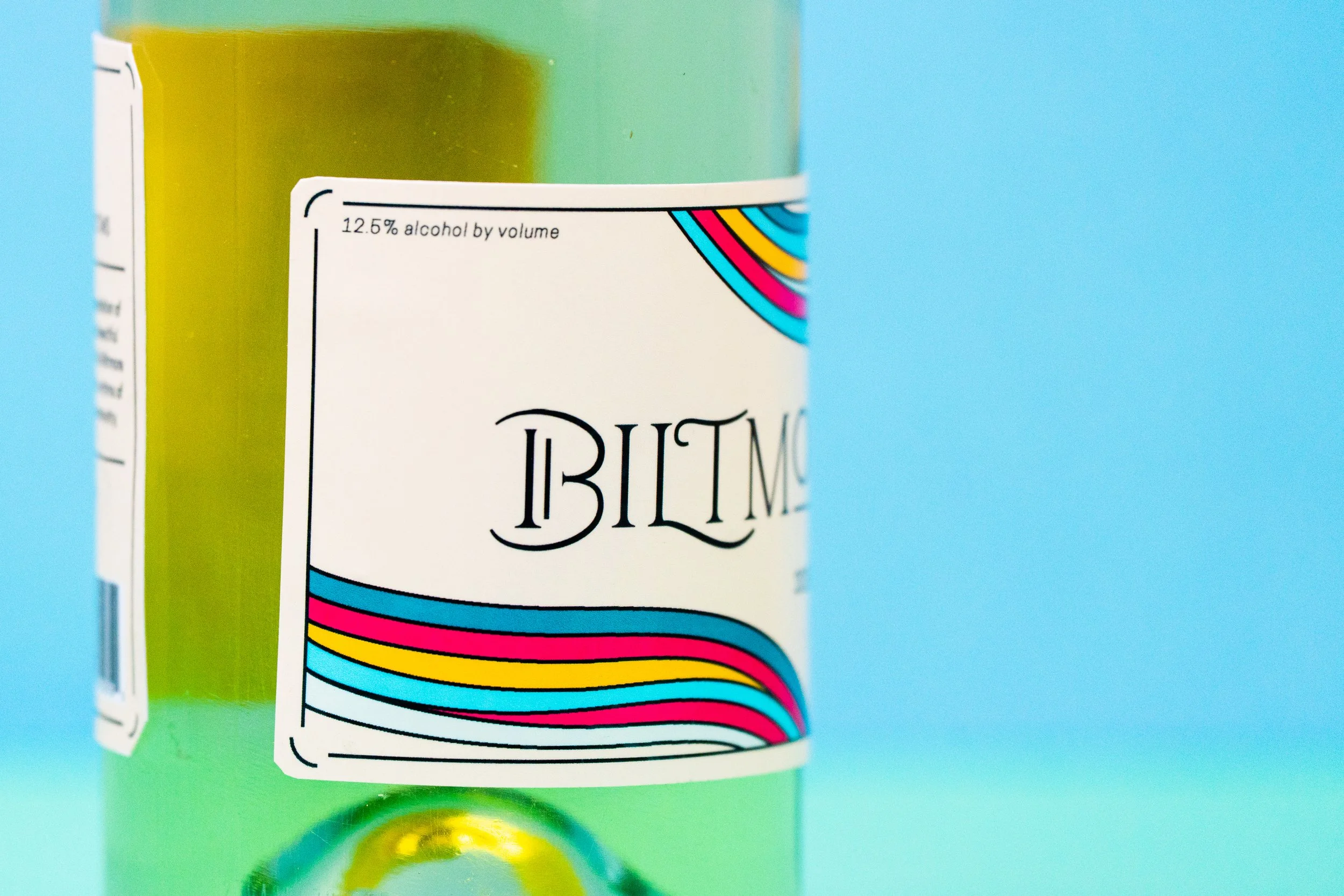
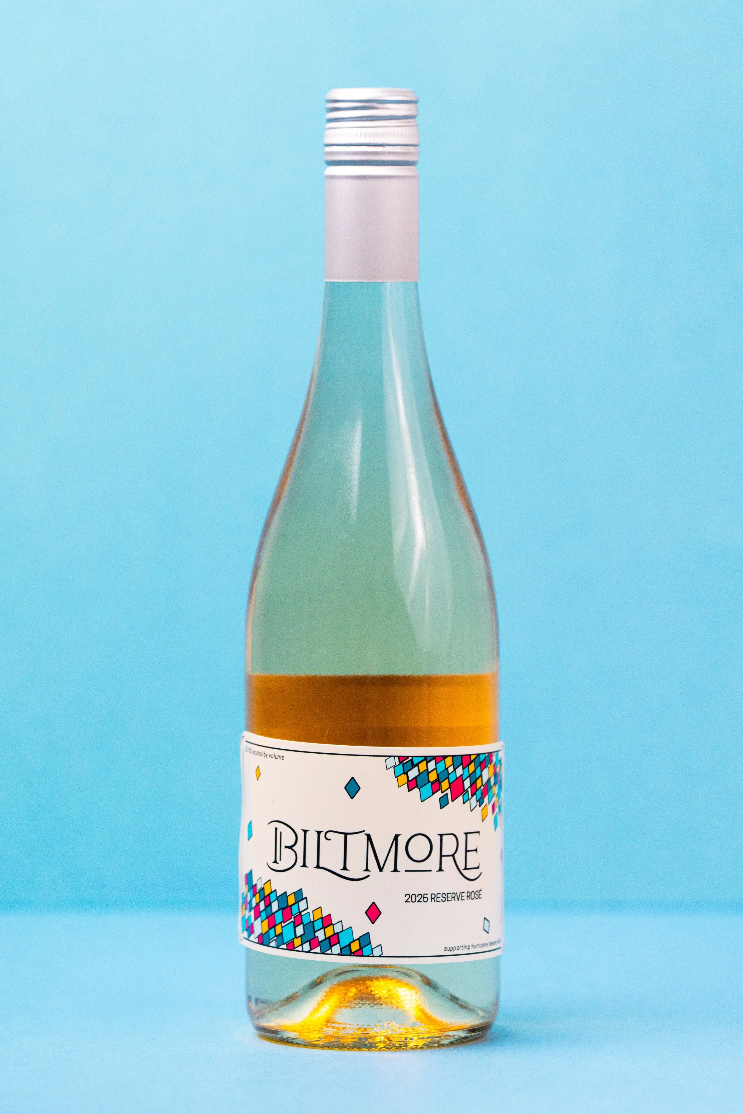
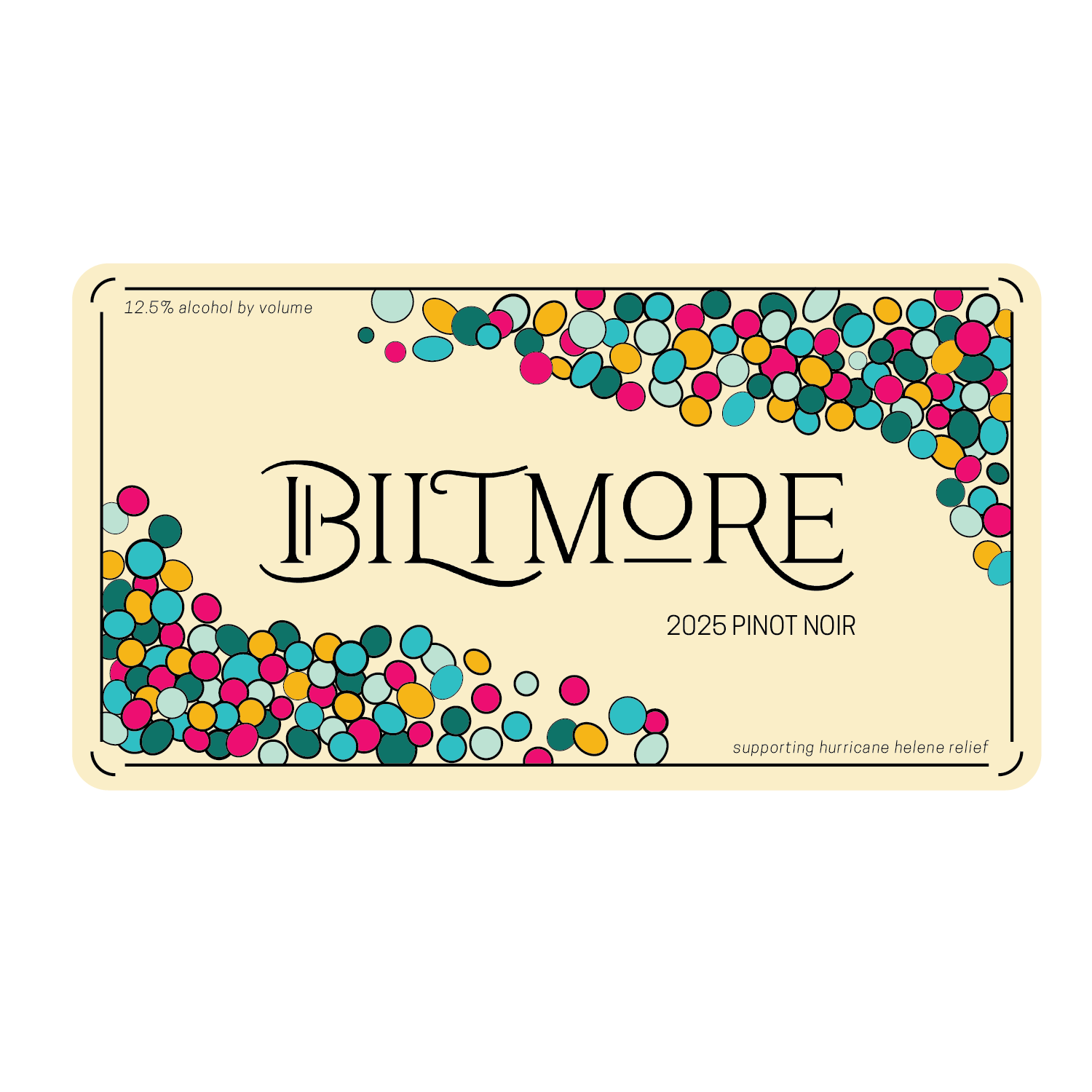
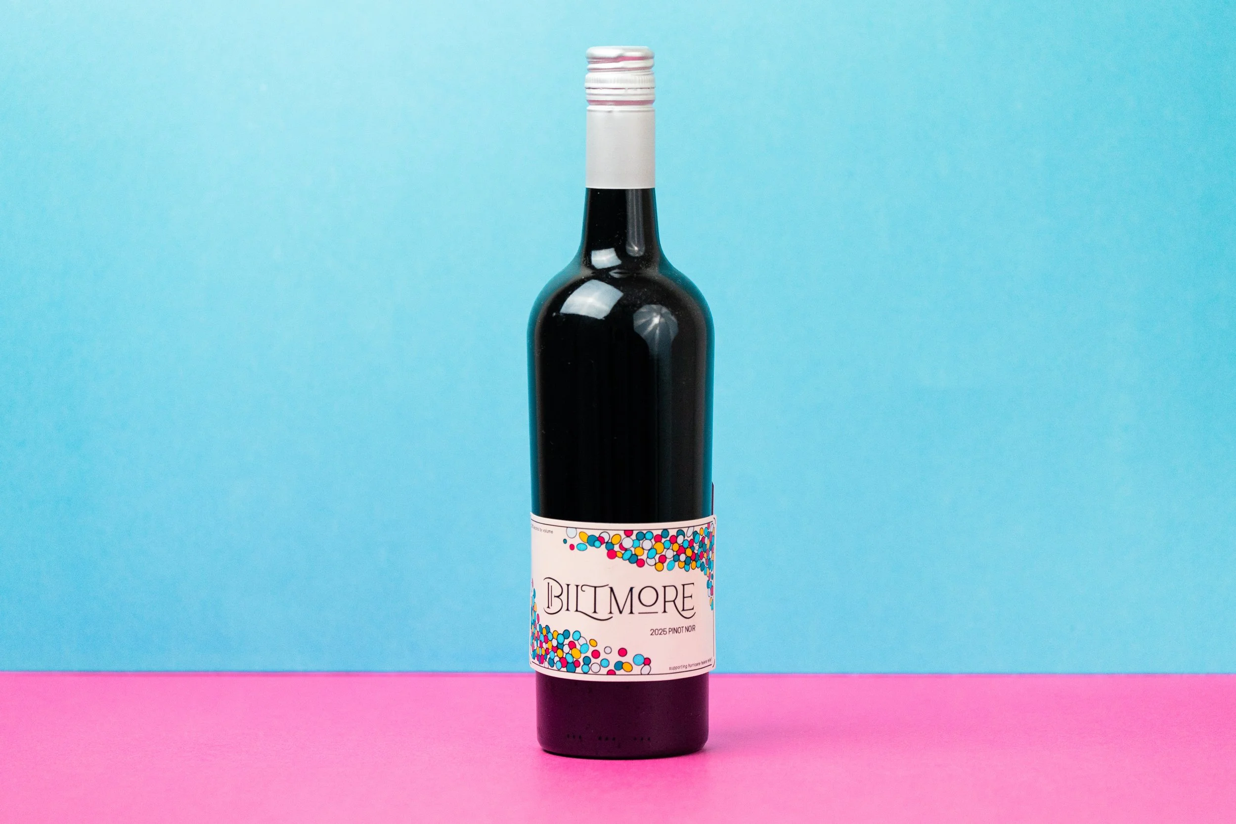
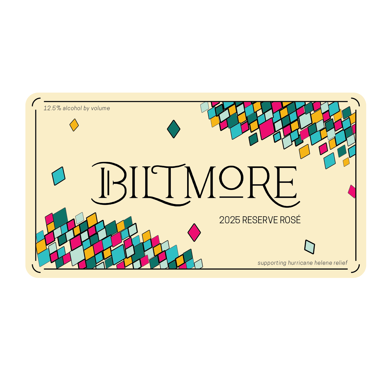
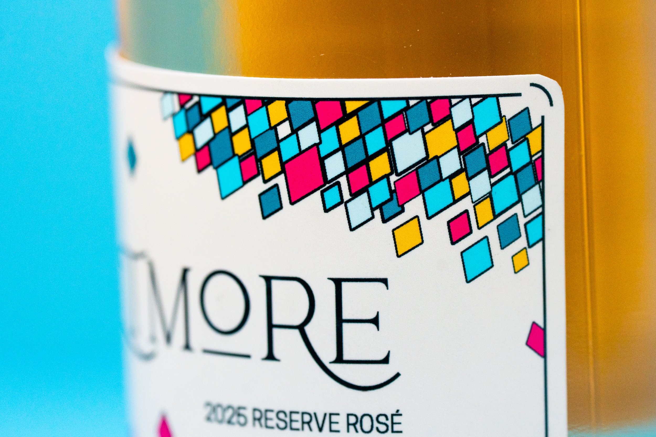
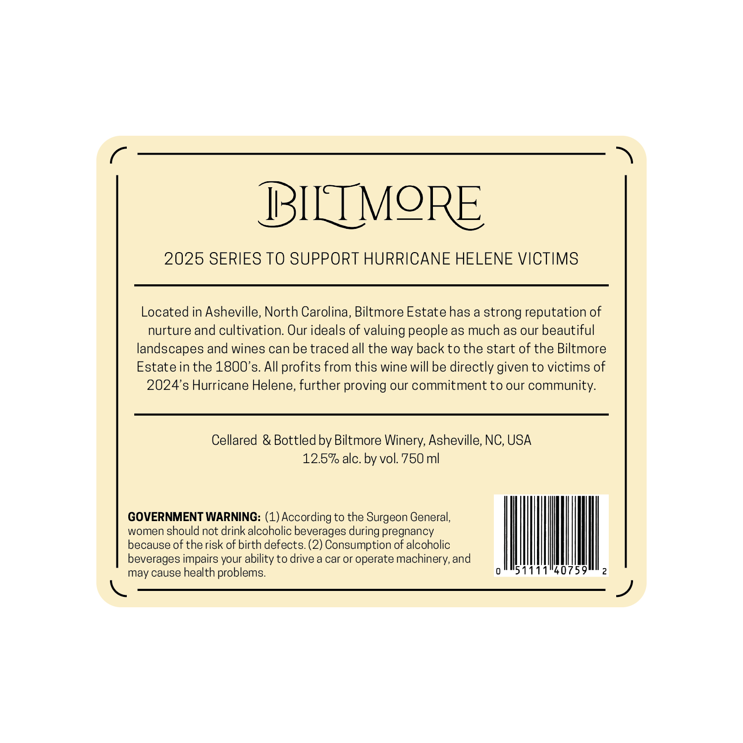
The Biltmore Winery rebranding project was inspired by Biltmore's beautiful gardens, colorful stained glass, stunning architecture,
and enduring commitment to their community.
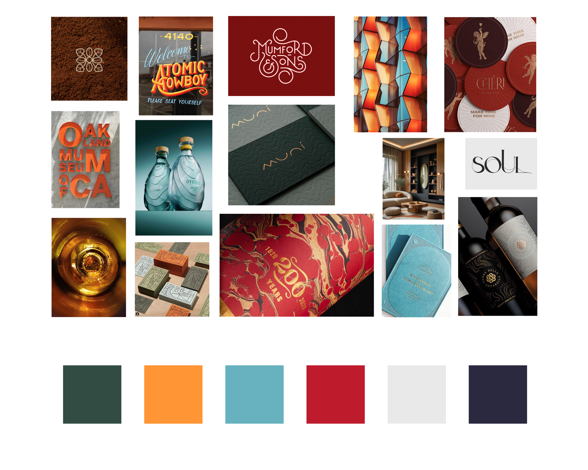
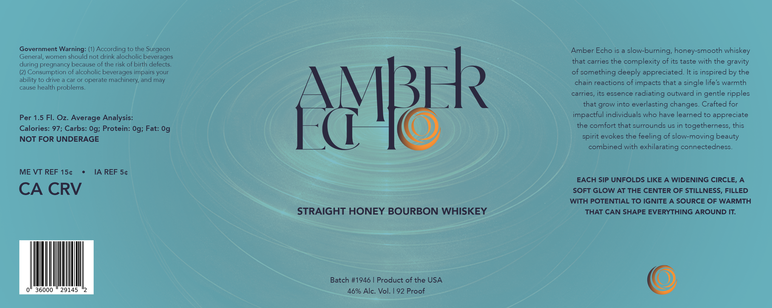
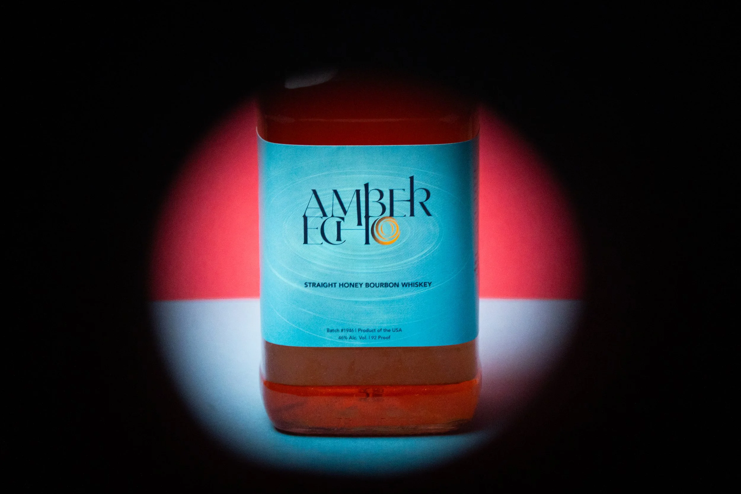
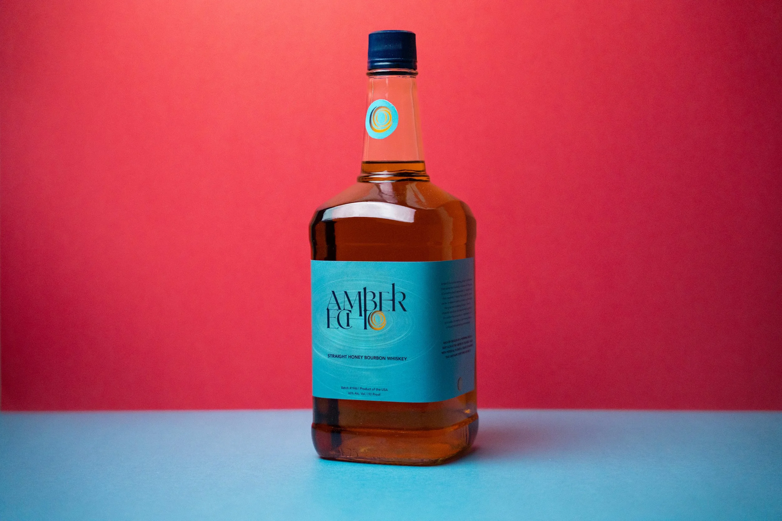
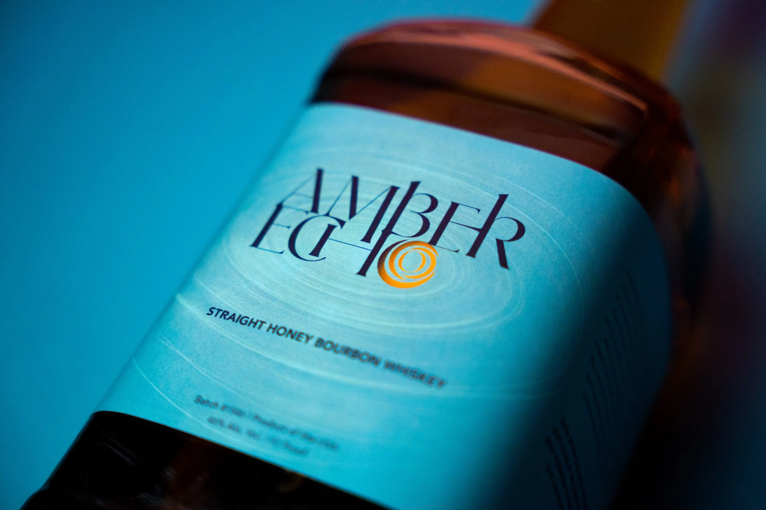
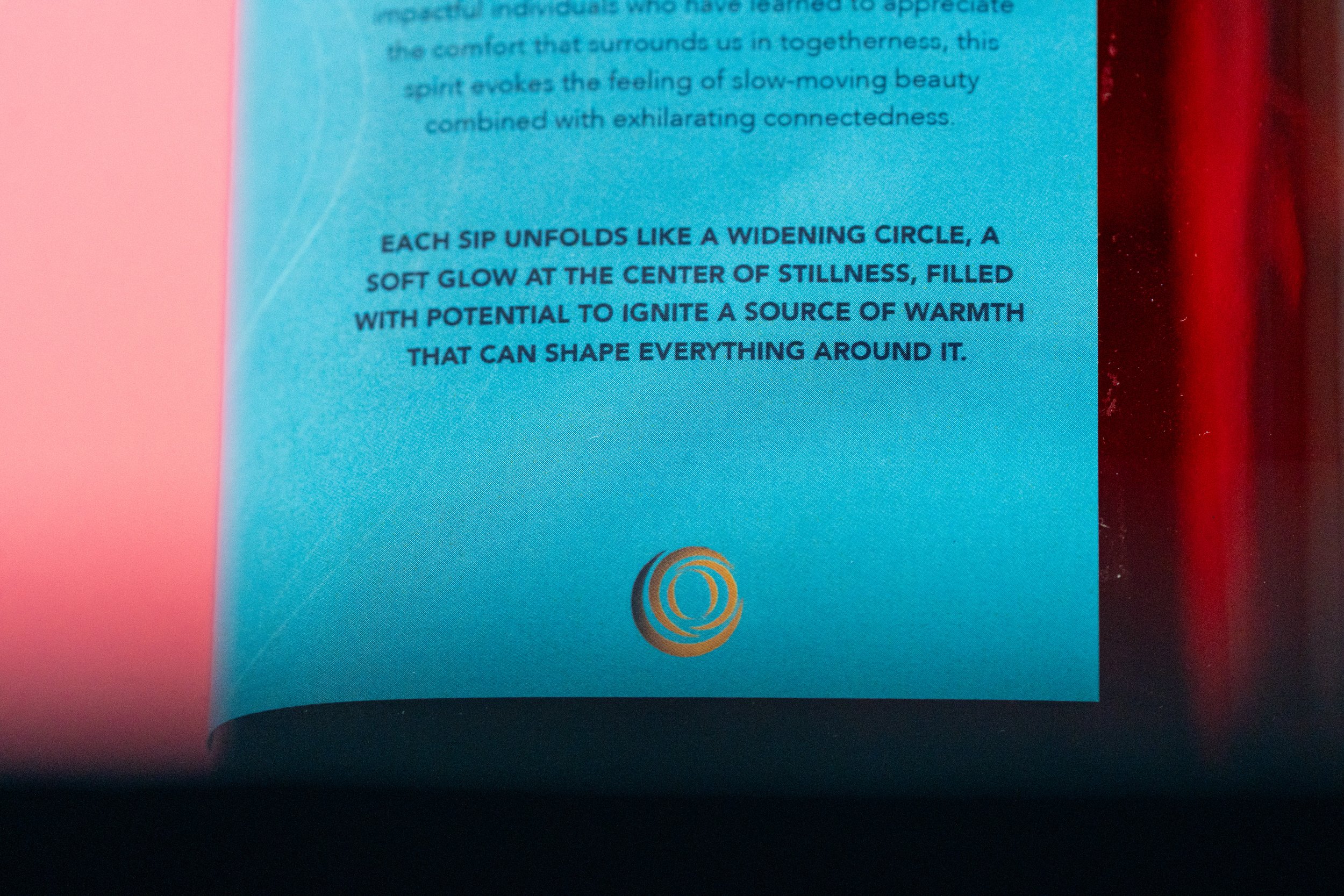
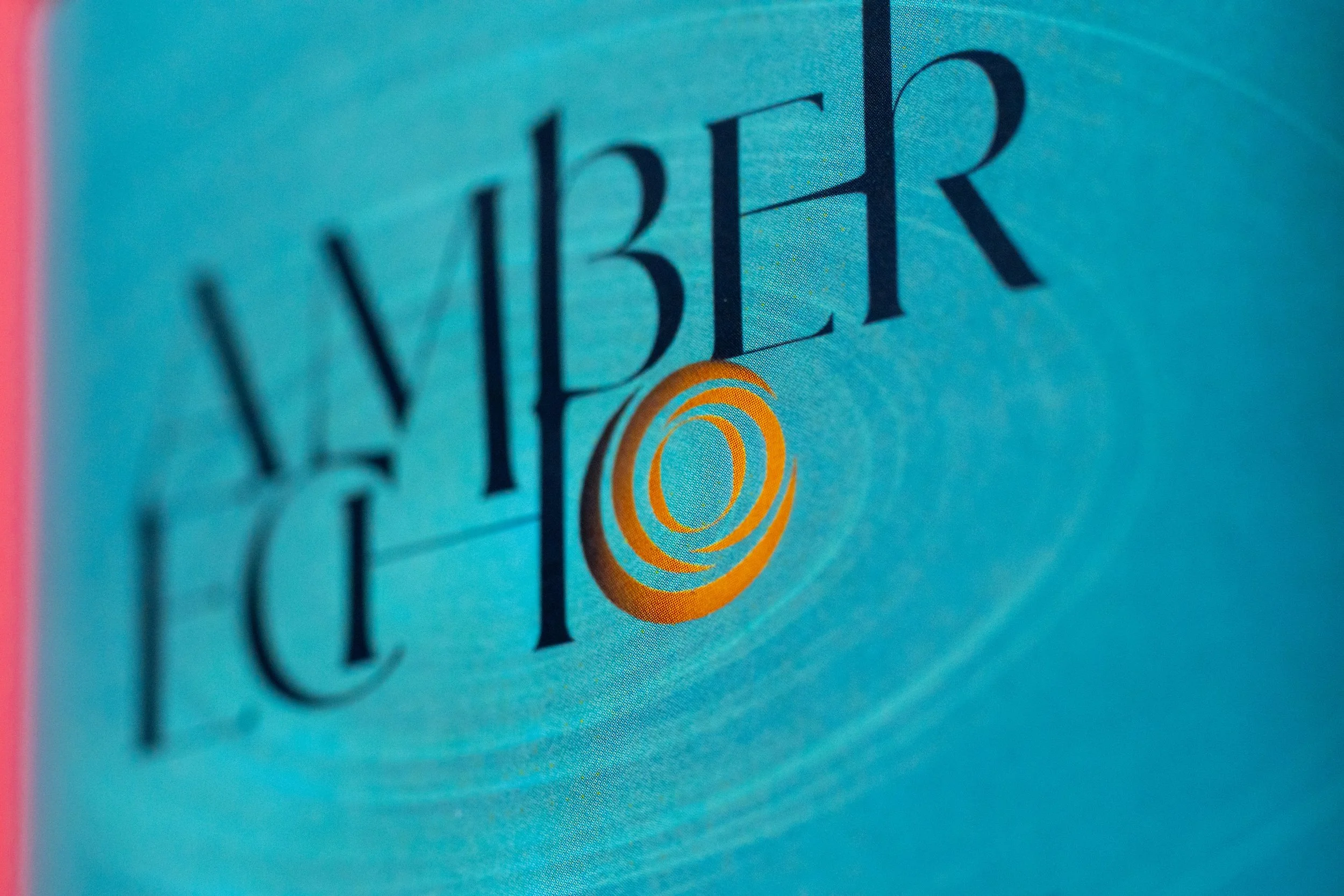
The Amber Echo branding project was inspired by the warmth of memory and the quiet comfort of coming home.